SPHCard Documentation
- This component uses the box-icons library.
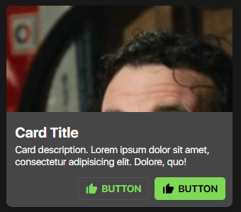
HTML
- The SPHCard component has three different modules, the
content module, themedia module, and theaction module. - Below is the code snippet of all the modules combined.
- Feel free to remove some modules depending on the need of your website /
About the .sph-card__actions module...
- Actions are, by default, made of SPHButton components. Calling the SPHButton component style is a must when you want to have card actions.
- Actions however are replaceable with your own custom card action style.
<div class="sph-card">

    <!-- MEDIA MODULE -->
    <div class="sph-card__media">
        <img src="https://www.fillmurray.com/200/300" alt="Card Image"/>
    </div>

    <!-- CONTENT MODULE -->
    <div class="sph-card__content">
        <h2 class="sph-card__title">CARD TITLE</h2>
        <p class="sph-card__description">Card description... Lorem ipsum dolor sit amet, consectetur adipisicing elit.
            Eaque, illum.</p>
    </div>

    <!-- ACTIONS MODULE -->
    <div class="sph-card__actions">
        <button class="sph-button sph-button--outlined">
            <i class="bx bxs-like sph-button__icon"></i>
            <span class="sph-button__label">BUTTON</span>
        </button>
        <button class="sph-button sph-button--filled">
            <i class="bx bxs-like sph-button__icon"></i>
            <span class="sph-button__label">BUTTON</span>
        </button>
    </div>

</div>
SCSS/CSS
CSS Classes & HTML Attributes API
| Class | Effect |
|---|---|
.sph-card | The main card component |
.sph-card__media | The media module of the card. This is where you put your card images |
.sph-card__content | The content module of the card. This is where you put the card title, and card description |
.sph-card__actions | The actions module of the card. This is where you put the call-to-action elements of the card (i.e. SPHButton). |
.sph-card__title | The card title. |
.sph-card__description | The card description. |
.sph-card__action | Provides special styling for the SPHButton components to be used in the context of a card. |
SCSS variables API (using with ())
| Property | Effect |
|---|---|
$card-fill | Changes the component's default state background color. |
$card-ink | Changes the component's default state text color. |
$card-radius | Changes the component's border radius. |
$card-elevation-color | Changes the component's elevation/shadow color. |
$card-title-size | Changes the card's title size. |
$card-description-size | Changes the card's description size. |
@use '~@surpathhub/ugnay/SPHCard' with (
    $card-elevation-color: #ffffff
);

@include SPHCard.use();
CSS custom properties API
| Property | Effect |
|---|---|
--sph-card-fill | Changes the component's default state background color. |
--sph-card-ink | Changes the component's default state text color. |
--sph-card-radius | Changes the component's border radius. |
--sph-card-title-size | Changes the card's title size. |
--sph-card-description-size | Changes the card's description size. |
.sph-card {
    --sph-card-fill: blue;
    --sph-card-ink: #FFF;
    --sph-card-icon-ink: #FF9900;
}